Tin tức
5 Retail Sign Tips Every Store Owner Should Know
When consumers visit your shop, one of the first and final things they notice is your retail sign. Signage controls the flow of customer traffic throughout your retail location and, if done incorrectly, may cause a great deal of confusion on your sales floor. To effectively draw more consumers in and orient them around your store in an efficient and profitable manner, you must first become expert in the fine art of retail sign.
Let’s look at the many forms of retail signage and talk about how to design and install signs that catch customers’ attention.

Nội dung
Use large typefaces
For your shop signage to be effective, customers must be able to read it. In fact, a recent research discovered that smaller signs garnered 75% less reaction than their larger equivalents.
Put yourself in your clients’ perspective when deciding on font size: Will they be driving by your retail sign in their automobiles, strolling past it, or seeing it on product labels? Larger fonts are also required for senior individuals and people with poor vision. Keeping this in mind will assist you in determining how large your font should be in order to reach all of your clients.
Another factor to consider when selecting typefaces is the clarity of the text itself. You won’t be able to reach out to potential clients using Wingdings, but some cursive and italic fonts are also extremely unsafe. It all relies on how visible the typeface is from the consumers’ eye level. For greatest effect, select typefaces that are clear and on-brand for your signs.
Check out this example from Ponder Posy, an Australian flower shop that employs a big, easy-to-read typeface for their business. A flower shop signage makes the business easy to find, and the fact that it states “FLORIST” in huge, bold letters ensures customers know precisely what the shop is all about.

Use the correct sign for the right purpose
Not all retail signs are made equal. Understanding the purpose of your shop signage is critical to making the proper investment. It’s one of the major “whys” of the visual merchandising industry. Let’s look at four different forms of retail sign and what you should know about them.
Outdoor Advertising
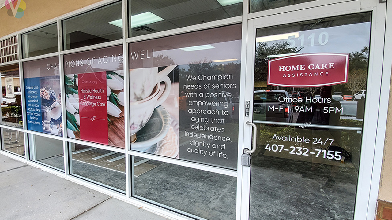
Customers’ initial impression of your shop is formed by your external signage. As a result, it must be bright and attractive enough to catch their attention. This is frequently accomplished through humour, but it is also necessary to display your company emblem and, at the very least, a teaser of the sort of goods you offer in-store.
The basic line is that visitors need to be persuaded to come in when they read the language on your outdoor signage—just putting up a hilarious saying without any form of inventory tie-in won’t cut it if your business is in an area where passersby aren’t already familiar with your items. Outdoor signage should be changed often, if not daily, to encourage repeat business from passersby.

Directional Markings
Indoor signage includes directional signs. These are the signage that direct people through your business. Most of these signage will be hung from the ceiling and visible as customers walk through the front section, assisting time-pressed shoppers in locating the things they came in for.
You don’t want to be too clever with your directional signs because it’s there to save your consumers time. It should be noted that directional signs can also take the shape of floor decals.

Promotional Signage
Here’s a good one. Promotional signage uses words that will attract your target customer demographics.
If you’re not sure what language to use to impress potential clients, do some research on the vocabulary their favorite companies use on social media. Is their tone comical? Edgy? Practical? What are the phrases they use? Your task now is to apply this information to your brand’s voice and inventory.
Give the customers enough detail about your goods to encourage them to buy what they think want, but avoid complex verbiage when expressing what makes your company unique. To advertise sales, promotional signs should be altered on a regular basis.

Digital Advertising
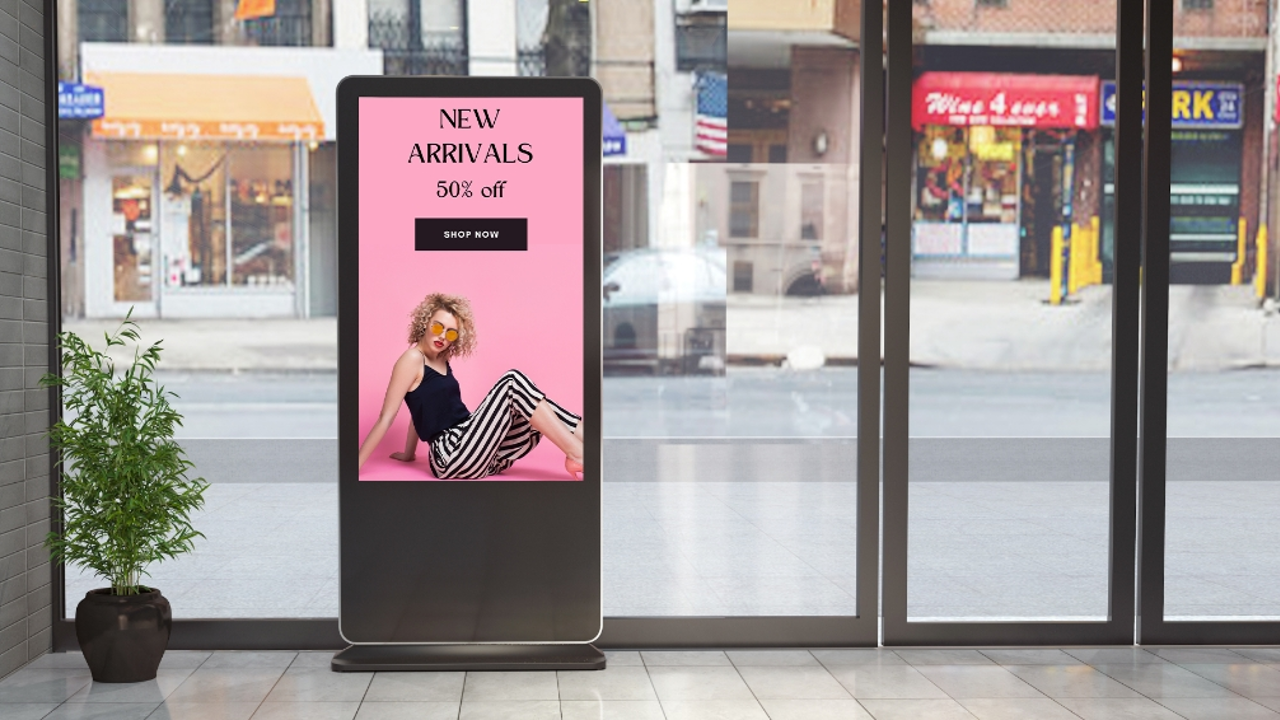
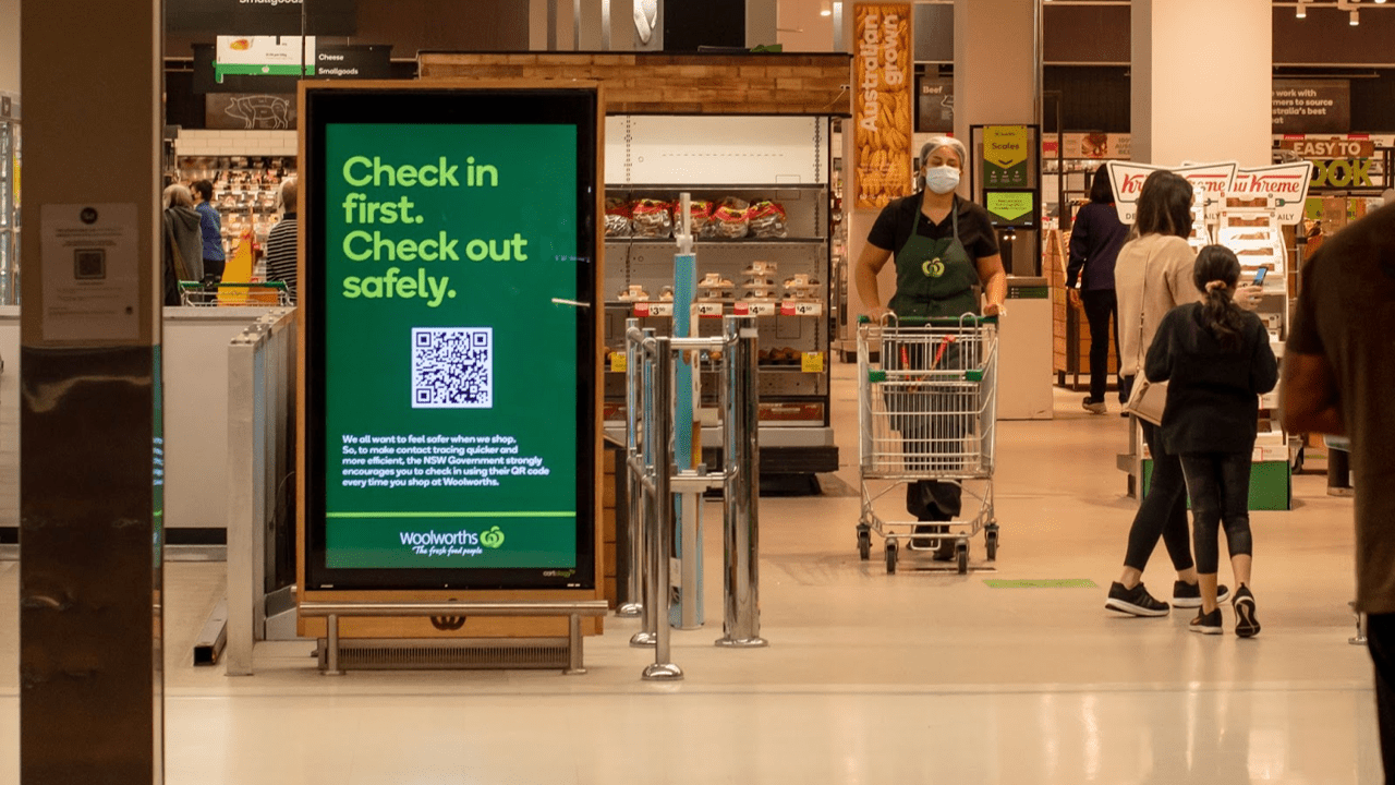
You may utilize digital signage to enhance your customers’ shopping experience. The majority of businesses (94%) have already implemented digital signage to boost the consumer experience. The advantage of digital signage is that it allows you to personalize your message based on the weather, time of day, what you’re selling, and even who comes into your shop.
Customisation, as you know, is critical to generating sales with modern clients, but there is a thin line between personalization and obnoxiousness. And synchronizing your clients’ browser history with your digital signs without their express permission? This is not a smart thing to do. According to a survey taken last year, providing too personalized of an approach would alienate customers, so ensure you get their buy-in when developing a personalised marketing experience using digital signage.
Because digital signage may be readily updated on the sign or in-app, you should alter it on a frequent basis to satisfy the demands of your various clients.

Decide the best locations for your store’s signage
In the signage sector, there are specific criteria that define where customers will go to identify your signs. Customers can view directional signs, for example, if it hangs from the ceiling or is higher than eye level in the aisle. While promotional signs will be placed at eye height in your window display or at ground level on the street to attract wandering passersby.
Keep in mind that “eye-level” is different for different people: children, buyers in wheelchairs, and people in cars all have different sign height (and text size) requirements, so test every signage positioning and height for yourself to determine the most effective height for your targeted consumers, while also considering each sign’s intended function.

Keep the sign short and on point
There’s nothing worse than too much jargon in signage copy. Don’t let the graphics clutter obscure your shop’s message: always use the fewest words essential to convey your concept.
However, it is also critical to be aware of how many signs are displayed in a certain region. When a consumer is seeking to explore your inventory or make a purchase, nothing is more unpleasant than being overwhelmed with wordy, overcrowded signs. This is not a professional appearance.
Instead, use sparingly and keep the objective of your store signage in mind. And, I repeat, never… NEVER use all capitals when addressing your consumers on a sign. This comes off as screaming, and it is completely insulting to the customers who are spending money at your establishment.

Learn about colorimetry
When customers take a glance at a sign, several subconscious variables are at work. To begin, employ high- ontrast colors in your retail signage (black with white, dark with light, and so on) to increase client responsiveness by around 23%.
Colorimetry, or the emotions and connections we have when we are presented with a certain portion of the color wheel, is another crucial component to consider. It’s critical to understand the subconscious connections evoked by each hue so that you can ensure they’re in accordance with the picture you want to create. Here are some colorimetry fundamentals:
- Cool colours, such as green, blue, and aqua, help create a relaxing atmosphere. These are ideal for eco-conscious or self-care companies. Blue also evokes a sense of trust, making it ideal for financial organizations.
- Purple is a contemplative and calming shade. Purple can be used for spiritual and/or cosmetic lines and items.
- Warm tones, such as red, orange, and yellow, on the other hand, cause customers’ blood to boil. This is why a bright red SALE or CLEARANCE sign is used to create enthusiasm. Yellow is also a cheerful palette that is ideal for enticing young customers.
- Black is connected with power, strength, and luxury. It’s ideal for high-priced things like jewelry or designer shoes.
- White conveys cleanliness and/or new beginnings; consider weddings, lab coats, and kitchen equipment.

Bringing all that together
The retail sign you choose may either help or hinder your in-store experience. Every sign, from the chalkboard outside your store’s entrance to the directional signs showing where the exit is, must be brief, funny, easy-to-see (for all customers), and on-brand. Maintain a knowledge of the different applications for retail signage and implement advanced principles such as color theory and typeface in your business to guarantee that your retail signage never fails to impress.
What’s next?
If you want to make changes to your shop front or learn more about your signage options, our team at An Phat Signs Studio is here to help. With many years’ experience providing front-line 24/7 support to business owners, our team is well-placed to bring positive change to your business.
You can view our list of services in full from here. Or, if you have any questions and queries about how best to highlight your shop front, you can contact us directly and let a member of our in-house team help you find exactly what you need for your unique situation.
Our hotline and Zalo: 0566 7676 79
Our Facebook: An Phat Advertising


